Valiant Brand Guidelines
EVENTS . INTERIORS . WORKPLACE
Welcome to the Valiant Hire with Style brand guidelines. Here you’ll find detailed information on the correct and incorrect usage of logos, colors, tone, voice, and more. Feel free to use it appropriately and always check with Valiant Marketing prior to external use. Valiant exists to deliver hire with style. Inspiring unforgettable events transforming residential interiors and motivating innovative workplaces.
Tone of Voice
Contemporary, Innovative, Creative, Friendly, Professional, Reliable

LOGO
The Valiant logo is the instantly recognizable symbol and focal point of our brand. That's why it's so important to use the logo exactly as specified in these guidelines.
>> Download Logos Here <<
Always send proof to marketing@valiant.com.au before end-use.
1. Primary Logo - Tagline
INLINE
The tagline of Events, Interiors and Workplace represents the key divisions in which Valiant services. This logo is to only be used when approved and supplied by marketing.
COLOUR

Use this 'Colour ' logo when placed over a white or light background
REVERSED (WHITE)

Use this 'Reversed ' logo when placed over a dark background
2. Primary Logo - No tagline
INLINE


3. Secondary Logo
STACKED

4. Symbol
KNIGHT


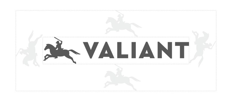
Clear Space
In order to give our logo maximum legibility and exposure, please allow for an area of clearance around the entire logo. The distance of clearance should be the height of the knight symbol from the base of the horse hoof to the end of the rider's sord. This gives the logo prominence and ensures that it will not be obscured or diminished by other surrounding elements.
Minimum Size
Never reproduce the Logo or the knight symbol at a size smaller than these recommendations, as it will result in the loss of their impact and readability.


Logo Usage
DO NOTCHANGE COLOUR
DO NOTSTRETCH / DISTORT
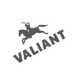
DO NOTANGLE / ROTATE
Fonts - our typeface
Cera Pro
Desktop Fonts
Font Usage Examples
H1 This is a Heading - Cera Pro 72px
H2 - THIS IS A SUBHEADING
CERA PRO REGULAR 20PX - CAPS LOOSE KERNING (LETTER SPACING) APPROX 150-200 - DEPENDANT ON THE SOFTWARE
H1 This is a Heading - Cera Pro 60px
H4 THIS IS A SUBHEADING
CERA PRO REGULAR 16PX - CAPS LOOSE KERNING (LETTER SPACING) APPROX 200- DEPENDANT ON THE SOFTWARE
H1 This is a Heading - Cera Pro 48px
This is body copy - Cera Pro - Regular 16px
This is body copy - Cera Pro - Regular 14px
This is body copy - Cera Pro - Regular 9-11pt (Print only)


