Brand Guidelines
VALIANT INTERIORS
Welcome to the Valiant Interiors brand guidelines. Here you’ll find detailed information on the correct and incorrect usage of logos, colours, tone, voice, and more. Valiant Interiors exist to transform property interiors across Australia through curating spaces to sell, own, and market.
Tone of Voice

THE LOGO
The Valiant Interiors logo is the instantly recognizable symbol and focal point of our brand. That's why it's so important to use the logo exactly as specified in these guidelines.
Download Logos
Always provide Marketing with artwork proof before using the Valiant logos for marketing purposes.
Primary Logo
INLINE


Secondary Logo
STACKED


Symbol
KNIGHT


Clear Space
Always surround our logo with white space (or exclusion zone, in design speak). To give our logo maximum legibility and exposure, please allow for an area of clearance around the entire logo. The distance of clearance should be the height of the Horse symbol from the base of the horse hoof to the end of the rider's sword. This gives the logo prominence and ensures that it will not be obscured or diminished by other surrounding elements.

Minimum Size
Never reproduce the Valiant Interiors logo or the Knight symbol at a size smaller than these recommendations, as it will result in the loss of their impact and readability.

Logo Usage - Things to avoid

DO NOTCHANGE COLOUR OR SIZE

DO NOTSTRETCH / DISTORT

DO NOTANGLE / ROTATE
Partnership Guidelines
PARTNER LOCKUPS
SPACING
The "Partner logo" graphic is only provided as a placeholder logo.


Fonts - our typeface
Stanley
Our signature (heading) typeface is Stanley. The text variants (designed in three weights with accompanying italics) remain discreet and understated but successfully convey the distinctive brand identity of Valiant Interiors. Typically this font will only be used in headings and only in Regular and Medium weights.
Desktop Fonts
Font Usage Examples
H1 - Stanley 72px
H2 - CERA PRO REGULAR 20PX - CAPS LOOSE KERNING (LETTER SPACING) APPROX 150-200 - DEPENDANT ON THE SOFTWARE
H3 - Stanley 60px
H4 - CERA PRO REGULAR 16PX - CAPS LOOSE KERNING (LETTER SPACING) APPROX 200- DEPENDANT ON THE SOFTWARE
H5 - Stanley 48px
Body Copy - Cera Pro - Regular 16px
Body Copy - Cera Pro - Regular 9-11pt (Print only)
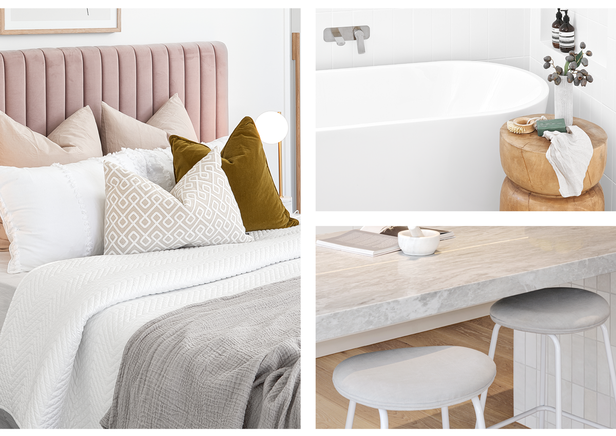
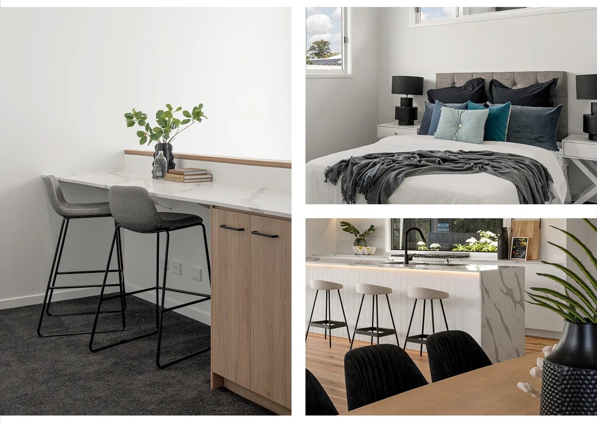
Imagery
- Showcase our styling capability
- Highlight the furniture selections, placement, and styling
- Creatively capture the essence of the interiors
Here are some references of considered imagery


